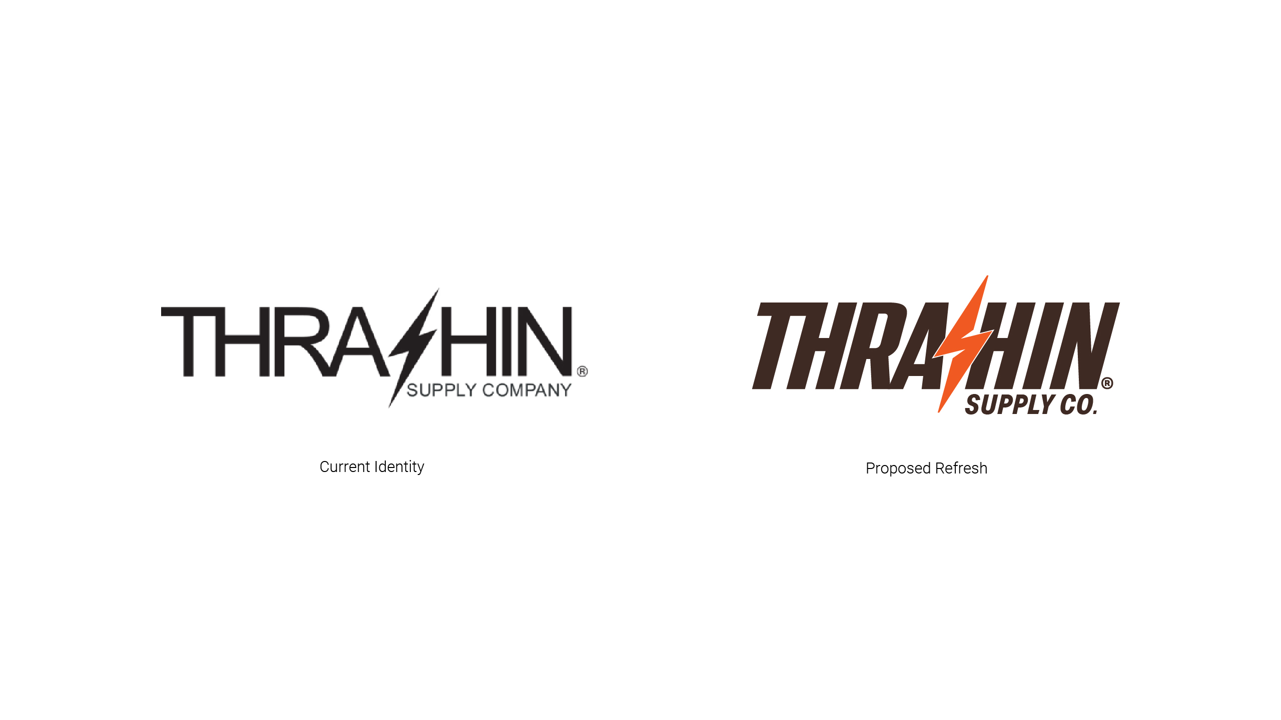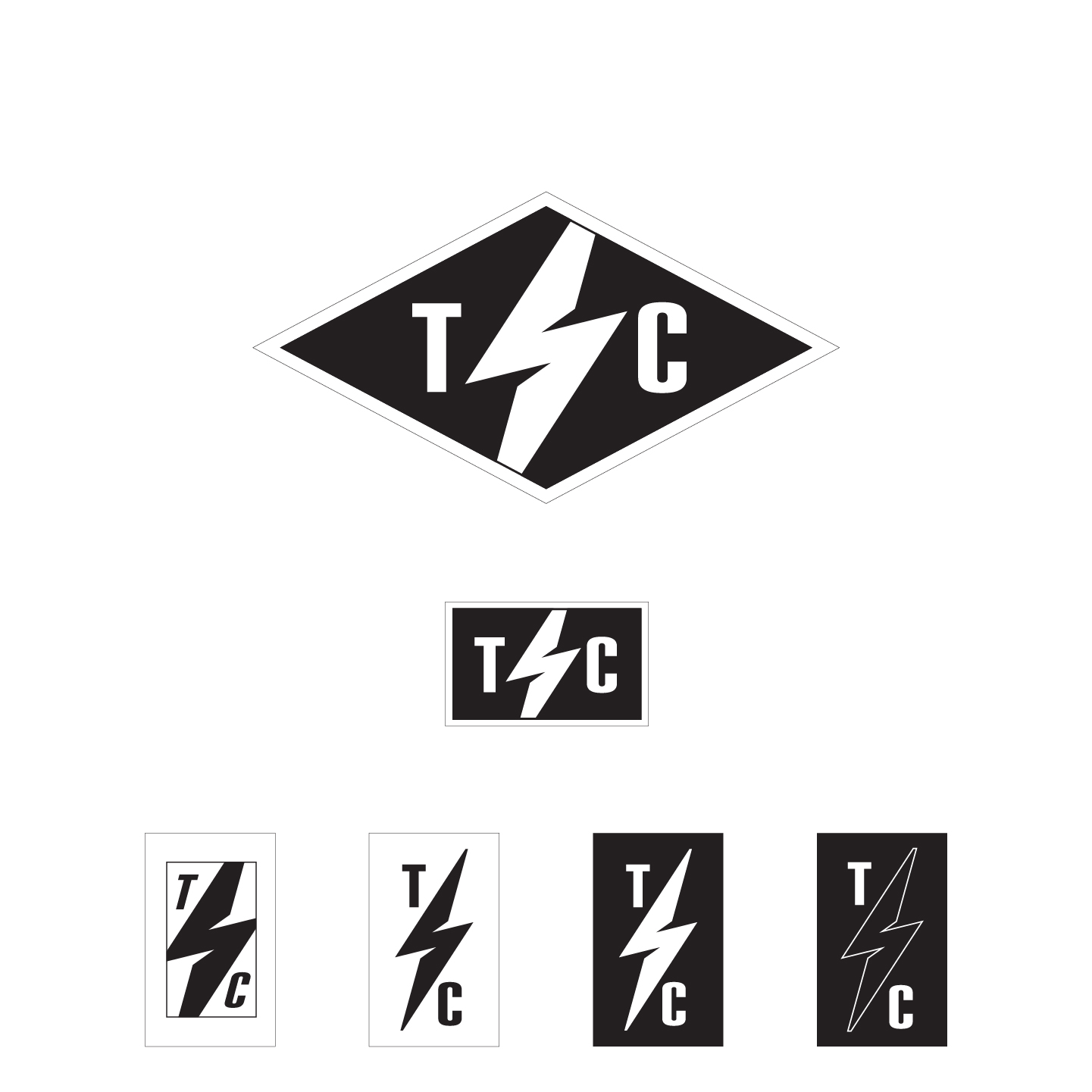

I wasn’t asked for this brand refresh.
I had an idea I couldn’t shake, so I built it.
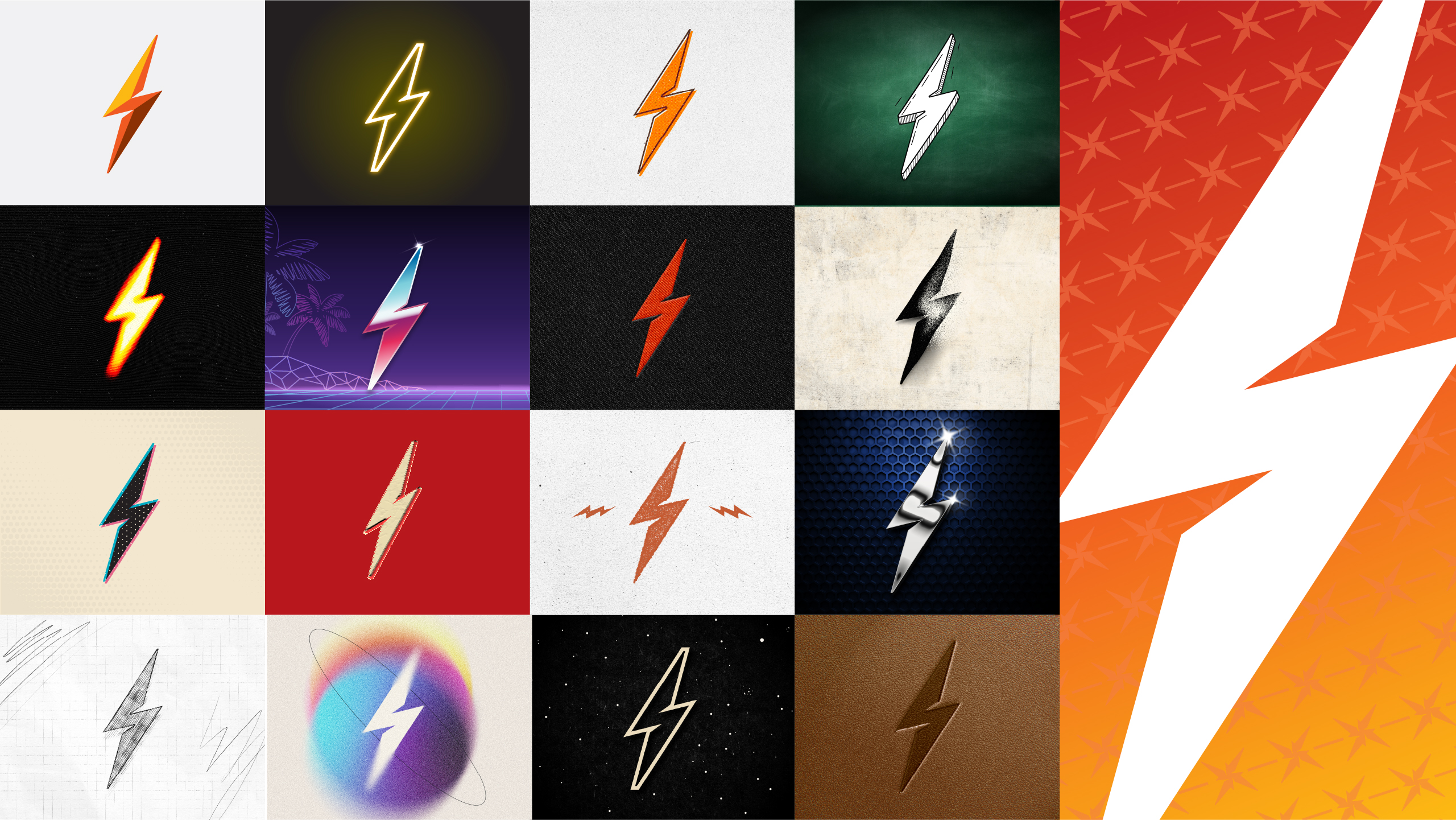
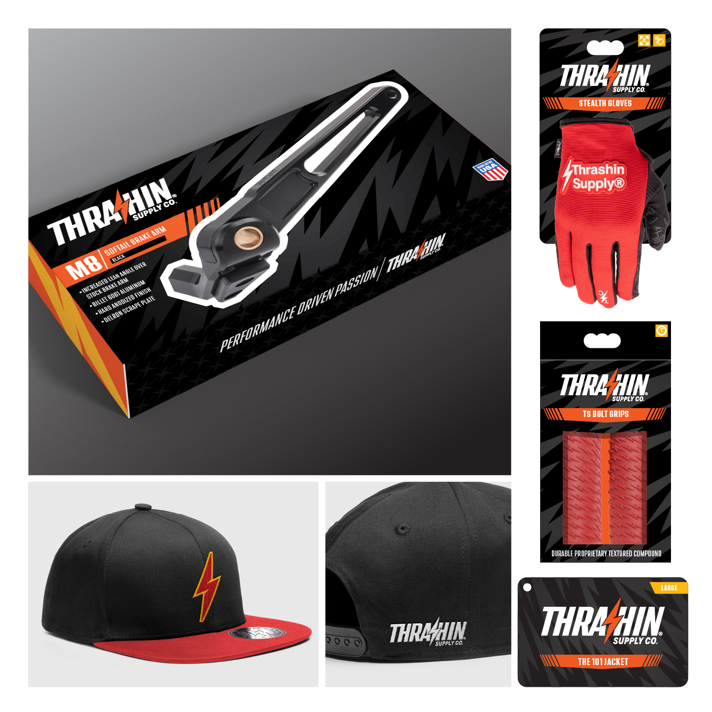
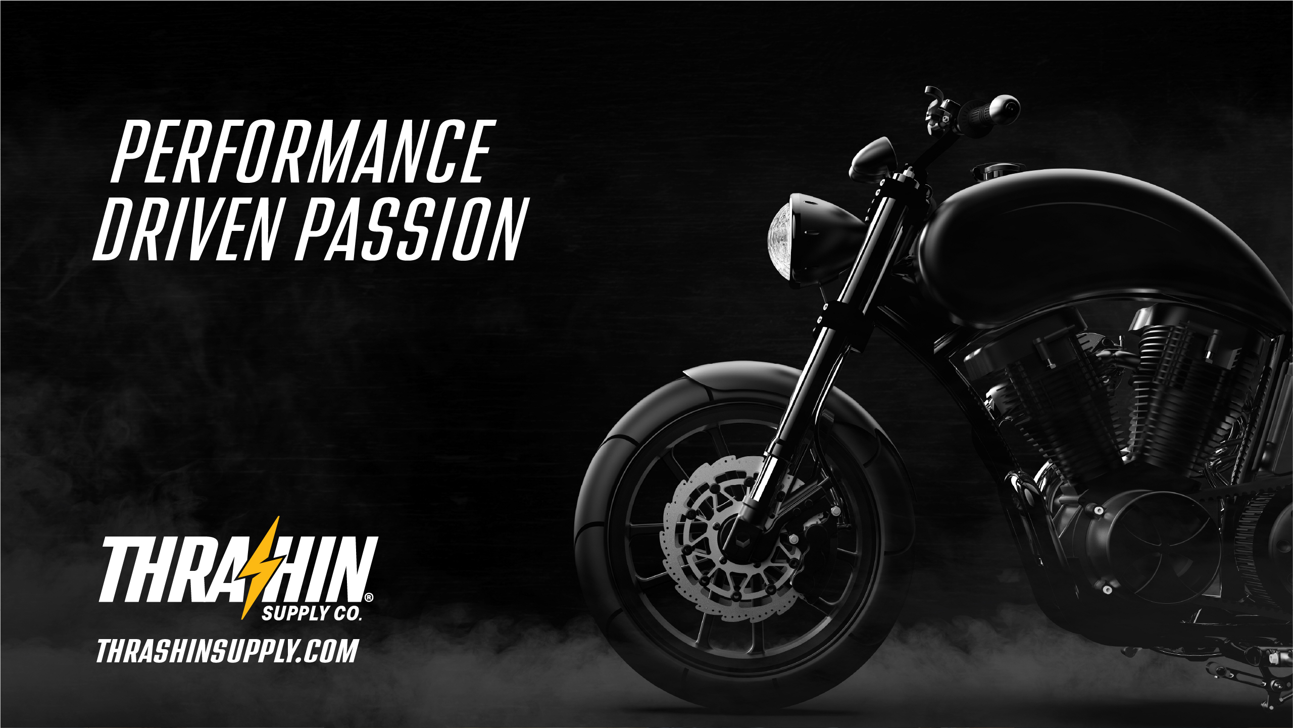
Thrashin solid brand. Being a culture heavy company allows them to have fun with their identity. They very much understand that and it’s proven by the graphics on their merchandise. Different font treatments, badges, and stylized graphics mean that there is something for anyone who wants to rep the Thrashin brand.
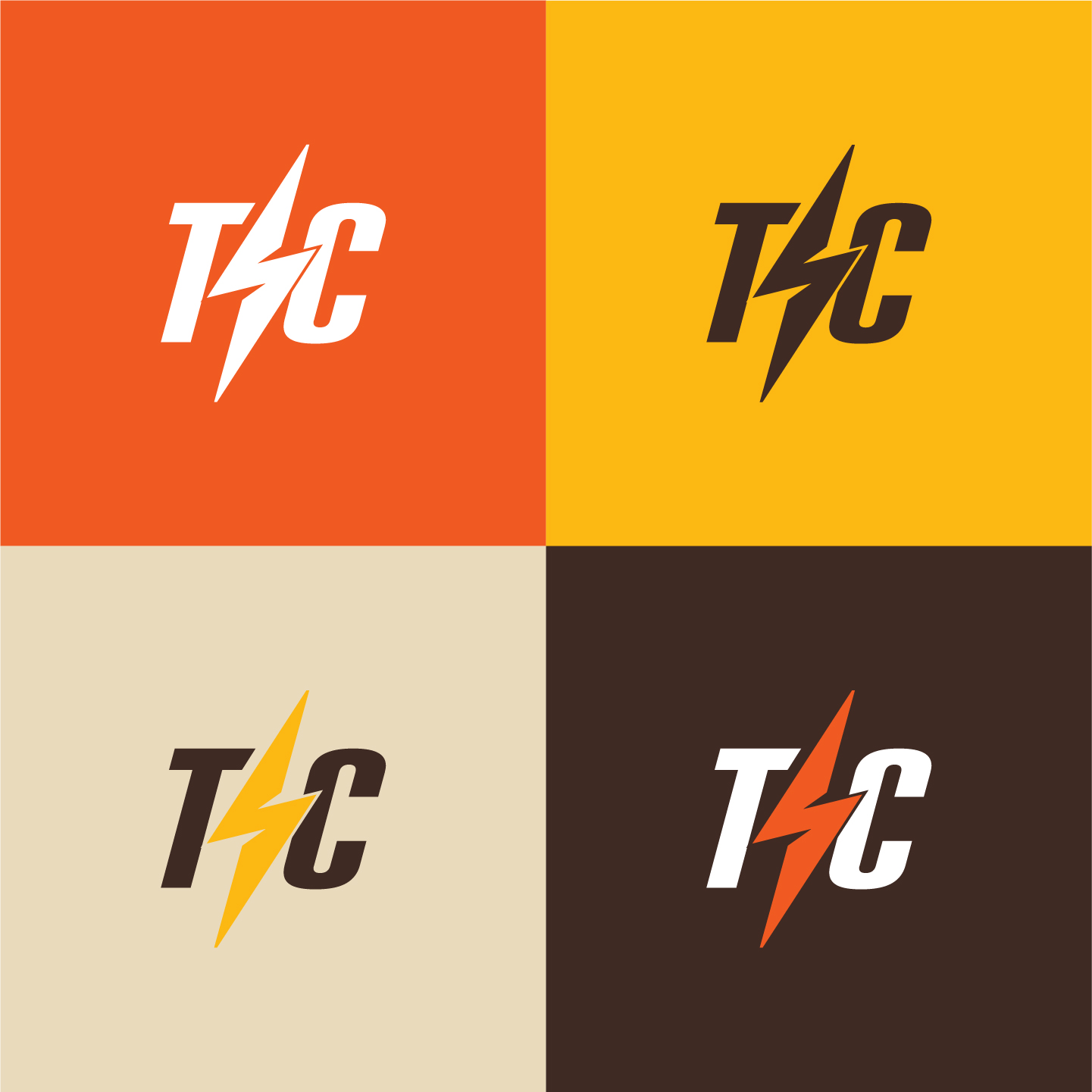
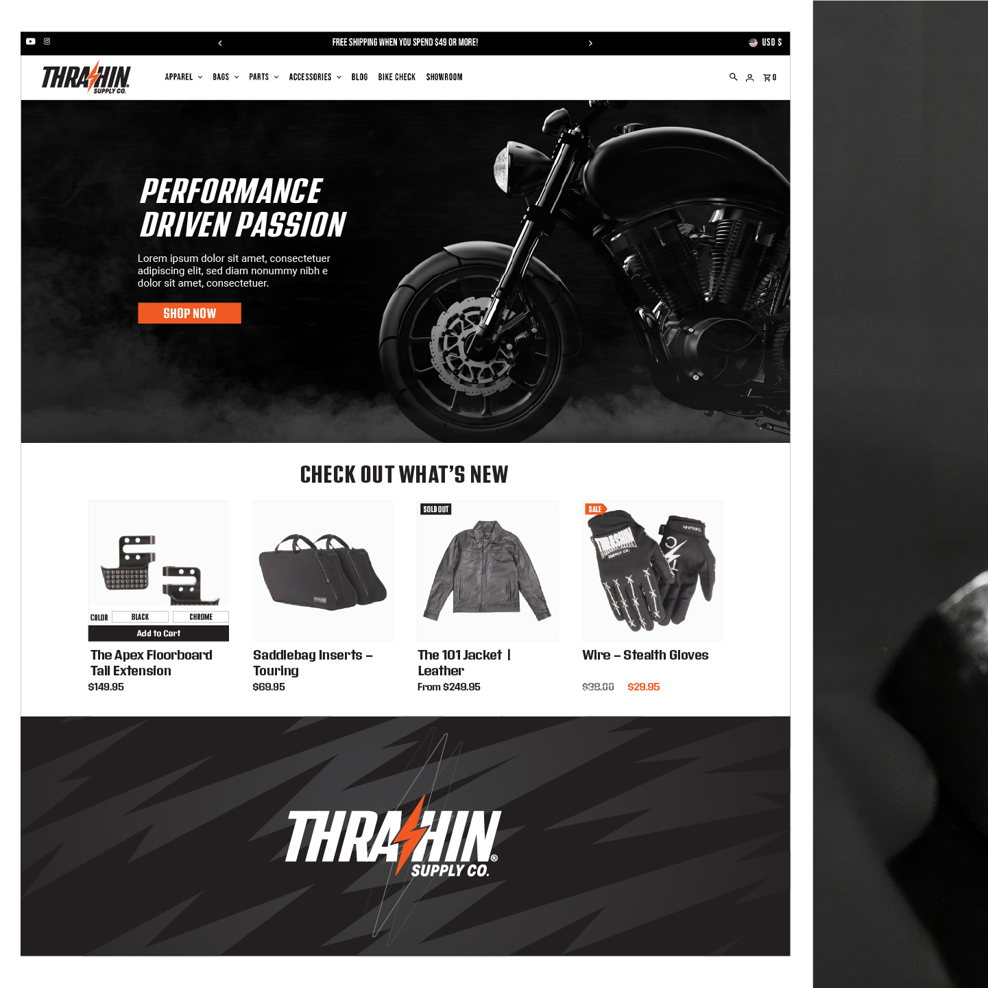
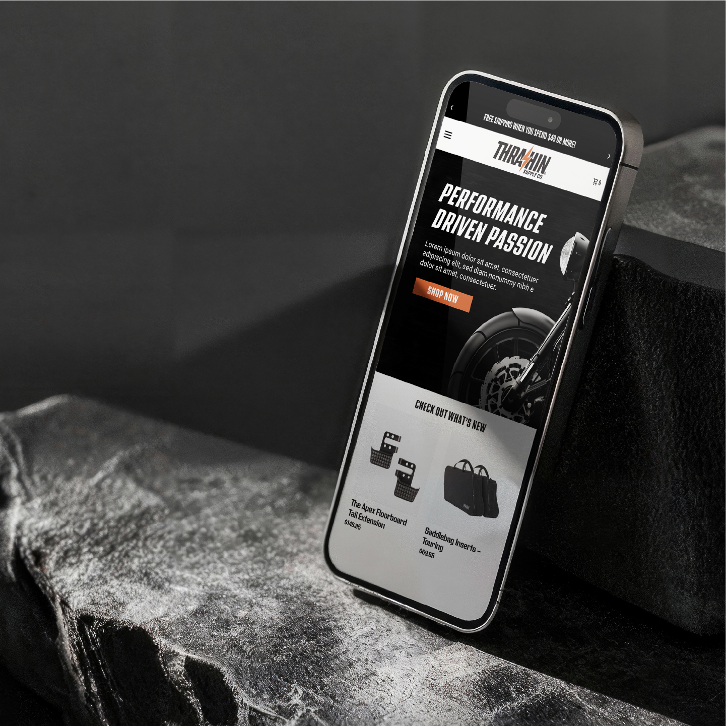
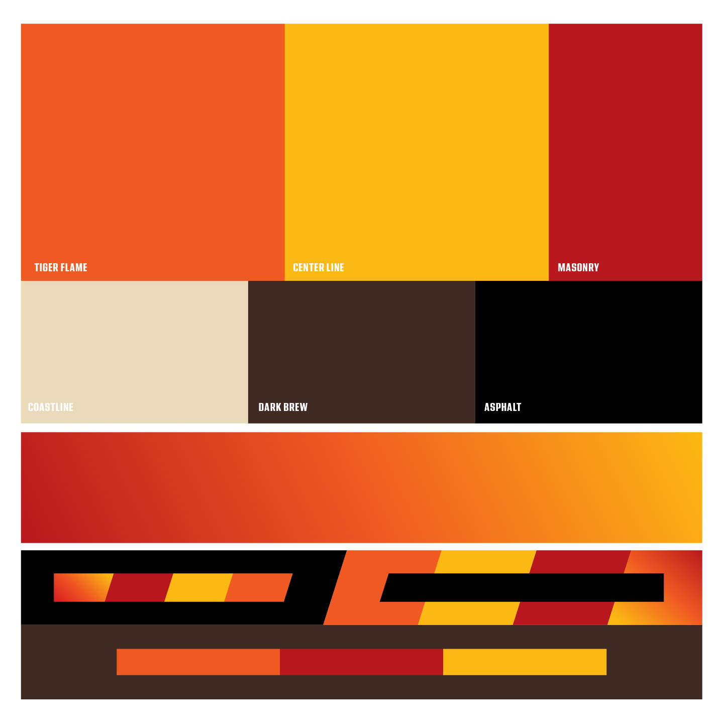
I aimed to reflect that here. The solution I offered holds true to the fantastic brand they have built, while adding a bit of movement and stylization intended to complement the greater brand as a whole.